Last September I wrote about the difference between underwriting with a pen vs. a paint-roller, exploring the problem with using analytics and data that are not able to accurately depict flood risk at a specific location. The post took a critical look at using FIRMs for underwriting flood insurance because they are not intended to depict location-specific flood risk (they’re pricing tools for the NFIP). That blog was very well received, so I thought I would follow it up with a graphical look at the same topic. The notion was reinforced by the news from Washington on the Flood Bill.
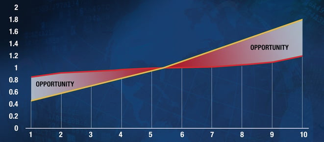
To do so, below is The Butterfly Chart. The inspiration for the chart is the National Flood Insurance Program in the USA, and is thus limited to areas deemed prone to flooding. Similar butterflies could be drawn for any system, including the hypothetical system whereby all homes in the USA are covered for flood as a non-excluded peril (wouldn’t that be cool?).

The horizontal axis is Flood Risk (low to high), and the vertical axis is normalized cost/price.
The red line is the normalized premium collected. Notice how flat it is – the premium collected is almost independent of risk. This is a representation of “underwriting with a paint-roller”, with the premium spread like eggshell paint over the whole flood prone area.
The yellow line is loss cost, and the steep line means that the cost of the risk of flooding at low-risk locations is much lower (a factor of 4 or more) than at high-risk locations. The line is steepened by the fact that flood’s loss cost, somewhat uniquely, is not only driven by the likelihood of a disaster, but also by the fact that low-risk floods are likely to be smallish, while high-risk floods are more significant and expensive.
As with all butterflies, the wings are the most interesting part. Each wing of the butterfly is full of opportunity for insurers:
 The left wing, where Loss Cost is lower than the premium collected is the cherry-picking, or find-and-bind, opportunity. These are locations where too much premium is being collected, and it is possible to compete on cheaper premium. The left wing is where almost all the current private flood insurance in the USA is positioned – private flood policies competing directly with NFIP policies on price (and conditions) where a risk assessment determines that the NFIP is overpriced.
- The right wing of the butterfly is the opportunity to generate more premium by pricing each risk according to the loss cost. This opportunity is not being exploited at all in the USA, with the NFIP missing it and the private market not addressing it (yet).
Interestingly, each wing requires a specific type of analytic to turn the opportunity into growth, revenue, and (ultimately) profit. For the left wing (in the USA), a cherry-picking analytic is needed to compare the flood risk at a specific location with the NFIP rating to produce a Yes/No (or Green Light / Red Light) output. The right wing requires that every location be assessed for flood risk on a scale that allows every risk to be priced accordingly (typically a scale of 1 – 10, or 1 – 100, or A – D, or whatever). These outputs are completely different and derived differently.
Regardless of which wing is being pursued, this is an underwriting activity and underwriting analytics are the right technology to use (not accumulation software or cat models).


